
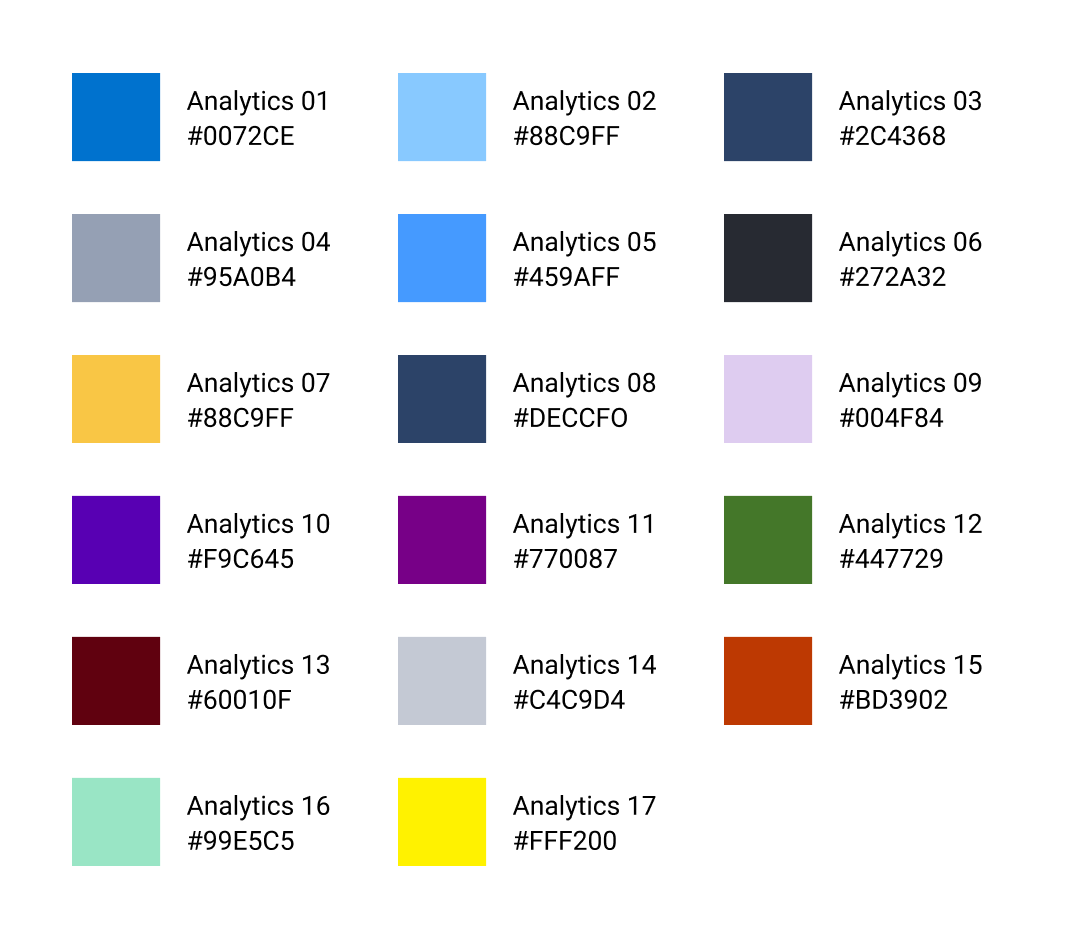
New analytics palette improves accessibility and clarity in reports and visualizations, including better support for all types of colorblindness.
First Challenge
Agricultural scientists are experts in monitoring soil health, crop quality, and handling issues that arise during the planting, growth, and harvest cycles of crop production. In order to protect the food system from a multitude of potential pests and problems, they work with many farmers at once to gather and act on specialized data to maximize yield: data which, until my work with the company, was largely offline. I led the creation of data visualization principles and guidelines, delivering three critical new dashboards to act as the flagships for the new system along the way.
My Contributions
1 I gathered direct input from farmers, mid-level managers, agronomists, and C-level executives firsthand to ensure the data visualization guidelines would be ready for future dashboards of any type, even beyond the types of data the team is currently able to model. 2 One of my projects received a nomination for an award in Research & Development Innovation within the company. A robot won the award (seriously)... so no hard feelings.
01
New
Palette
02
Quality
Dashboard
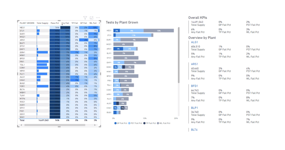
I worked directly with some of the world's foremost experts on crop quality to understand how they would want to consume the data in this report: a heatmap allows the scientist to determine which sectors of the grid need attention (where production is at risk) and calibrate the information against the total supply each site is providing, represented in a simple bar at the left of each row.
Simple is
often best
While it might seem odd not to use something like red for an issue that requires a user's attention, we wanted to avoid confusion of any kind with this view and focused on achieving the following:
- consistency with the Corteva brand identity,
- contrast (even for users with visual impairments or colorblindness), and
- clarity.
Staff Product Designer
Jack Reis
Power BI
Fede Dos Santos
Data Modeling
Nina Sönnenborne